Despite the great variety and diversity, the gaming industry is often perceived as something strict and fixed. Many communities, media, and games are affected by gatekeeping, discrimination, underrepresentation and toxicity.
Black Girl Gamers breaks out of these limitations and transforms the gaming industry into something more free, positive, progressive & moving forward.

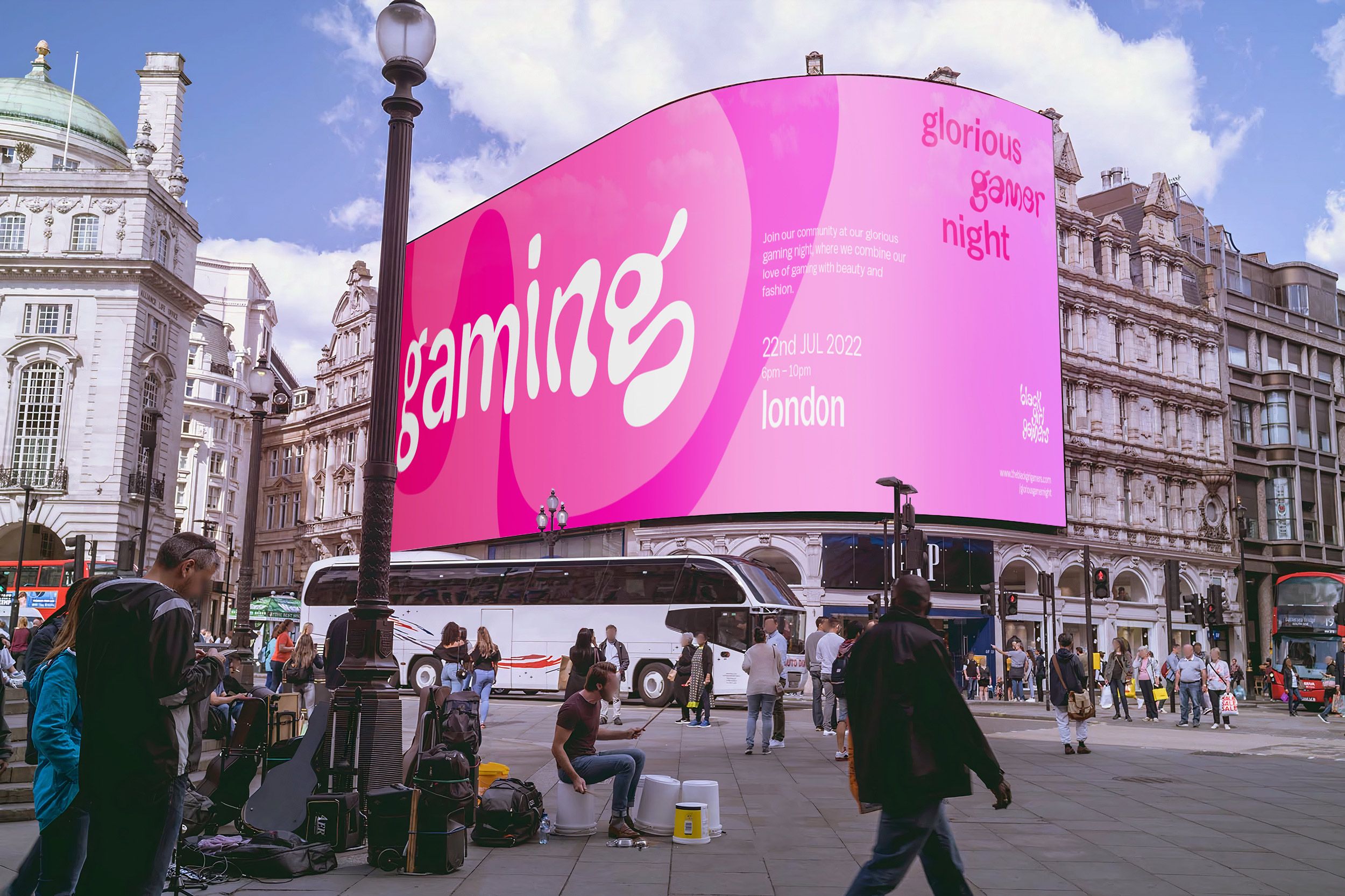
The concept for the visual realisation of the idea of reshaping is implemented using typography. The firm, serious and strict sans serif typeface dissolves and transforms into something dynamic and progressive. This new liquid object can assume any shape.
The visual language of the brand identity is built on this concept and represents Black Girl Gamers ambition of transforming the strict gaming industry. It combines a more serious and professional look with a playful and colorful touch.
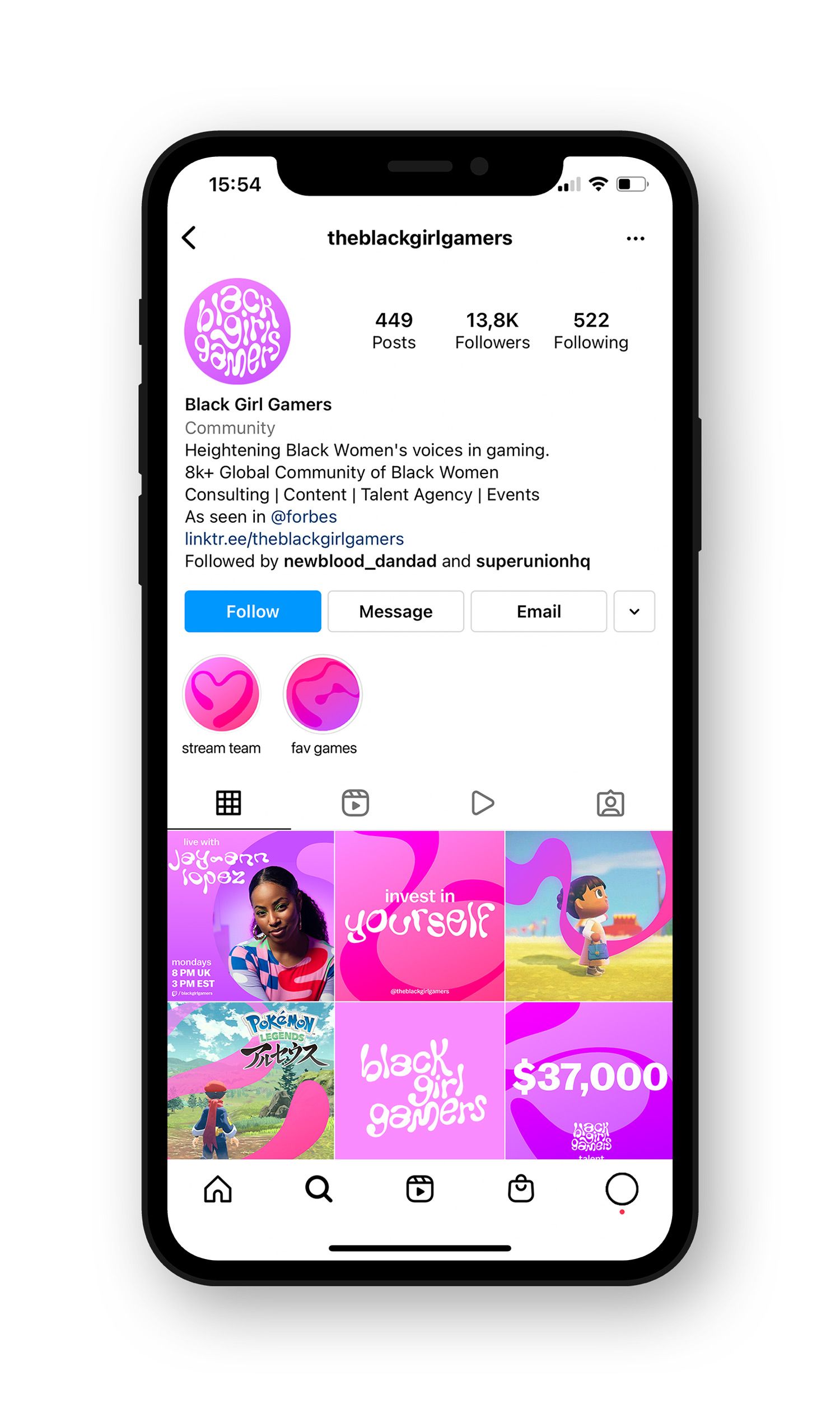
In order to not be limited by the strict limitations of a conventional logo, a variable logo is used in various shapes to reflect the concept of “reshaping”.
It comes with the freedom of being easily used in a variety of formats without having to be reduced to an anonymizing acronym or symbol.The colours are inspired by the current identity and maintain the vibe and authenticity of the brand.

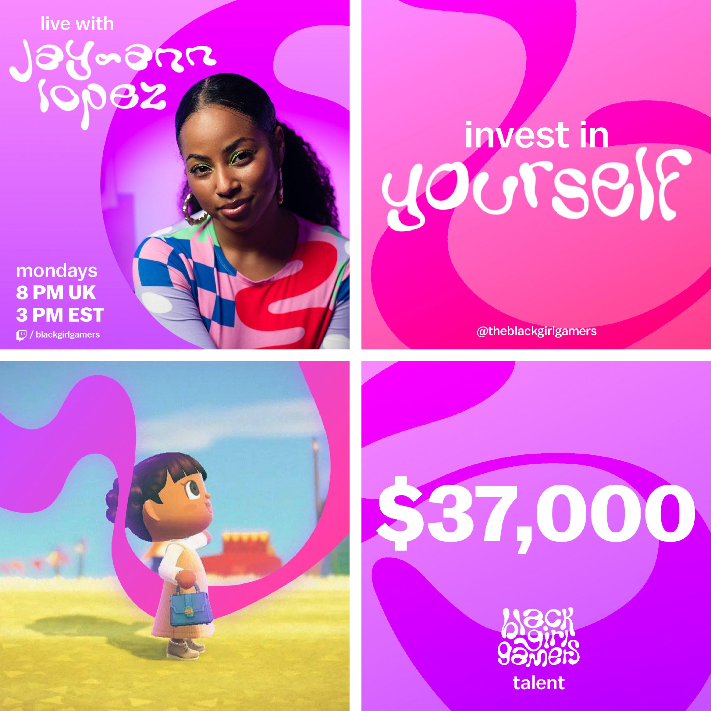
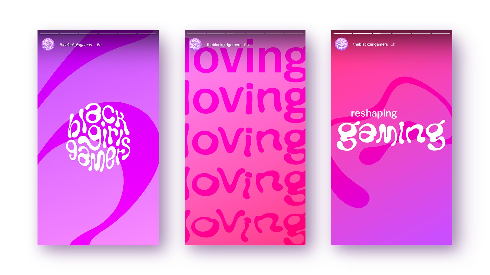
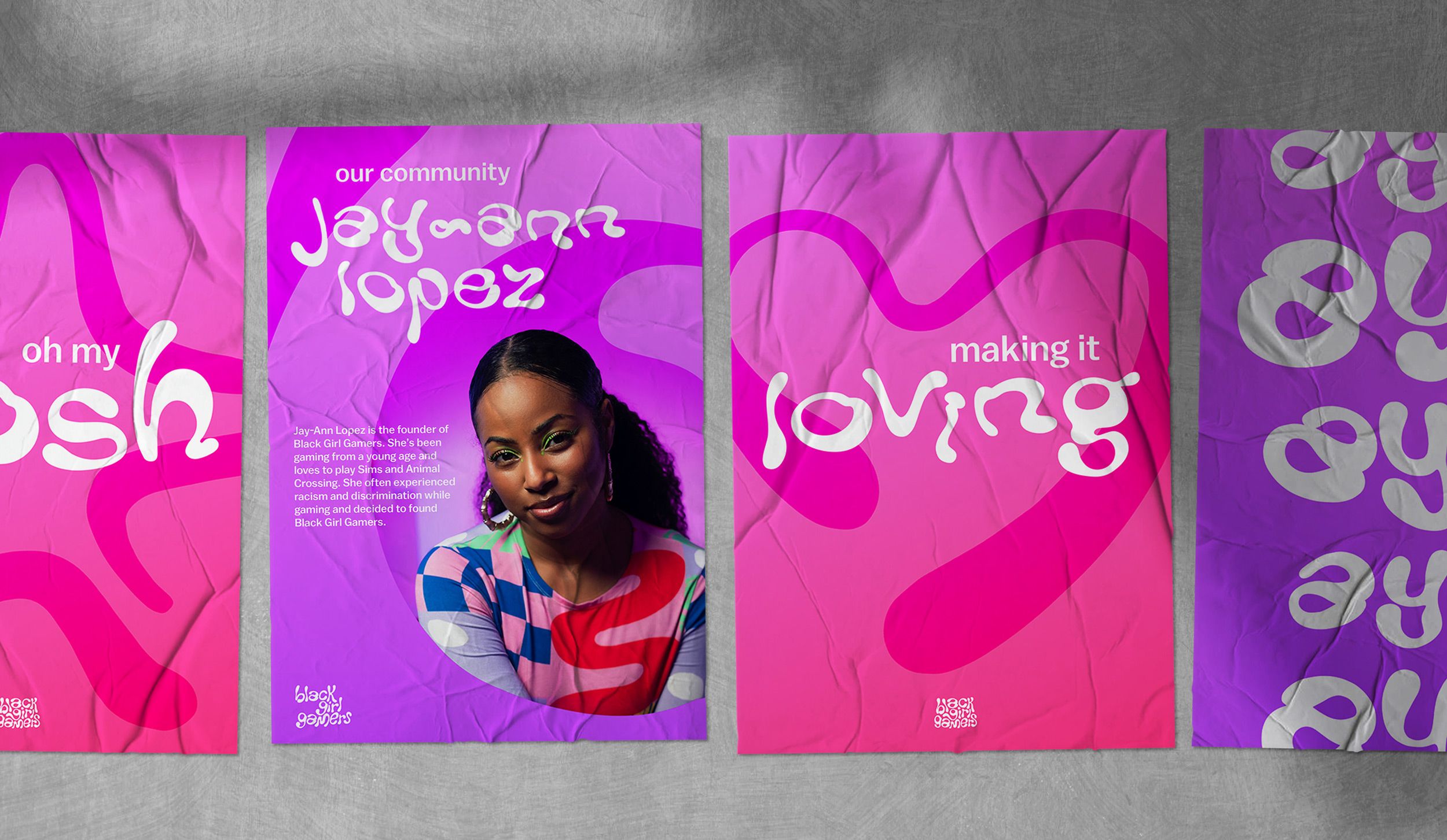
Brand awareness posters showing the vibe and personality of Black Girl Gamers and introducing different members of the community by sharing their personal story.
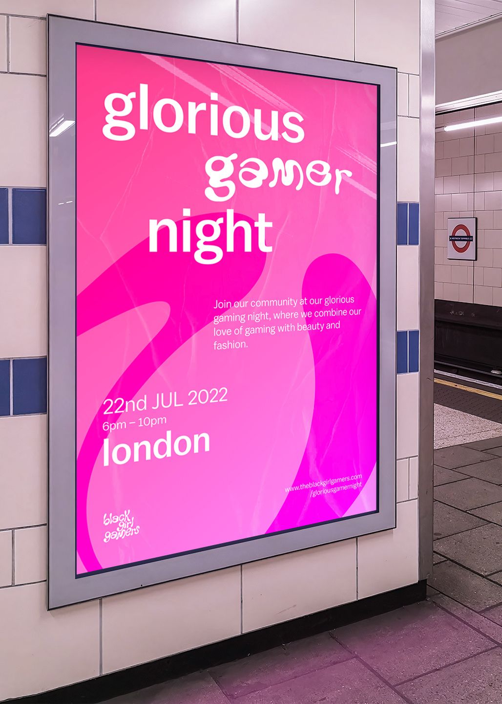
Poster and billboard of a potential live event called “glorious gamer night”. The words “gamer” and “gaming” are both displayed in the transformative font to highlight the impact of Black Girl Gamers on the gaming industry.
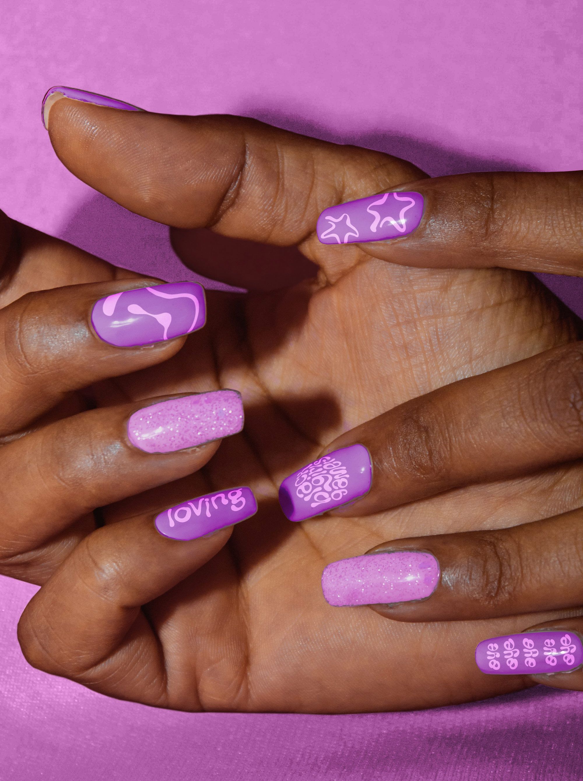
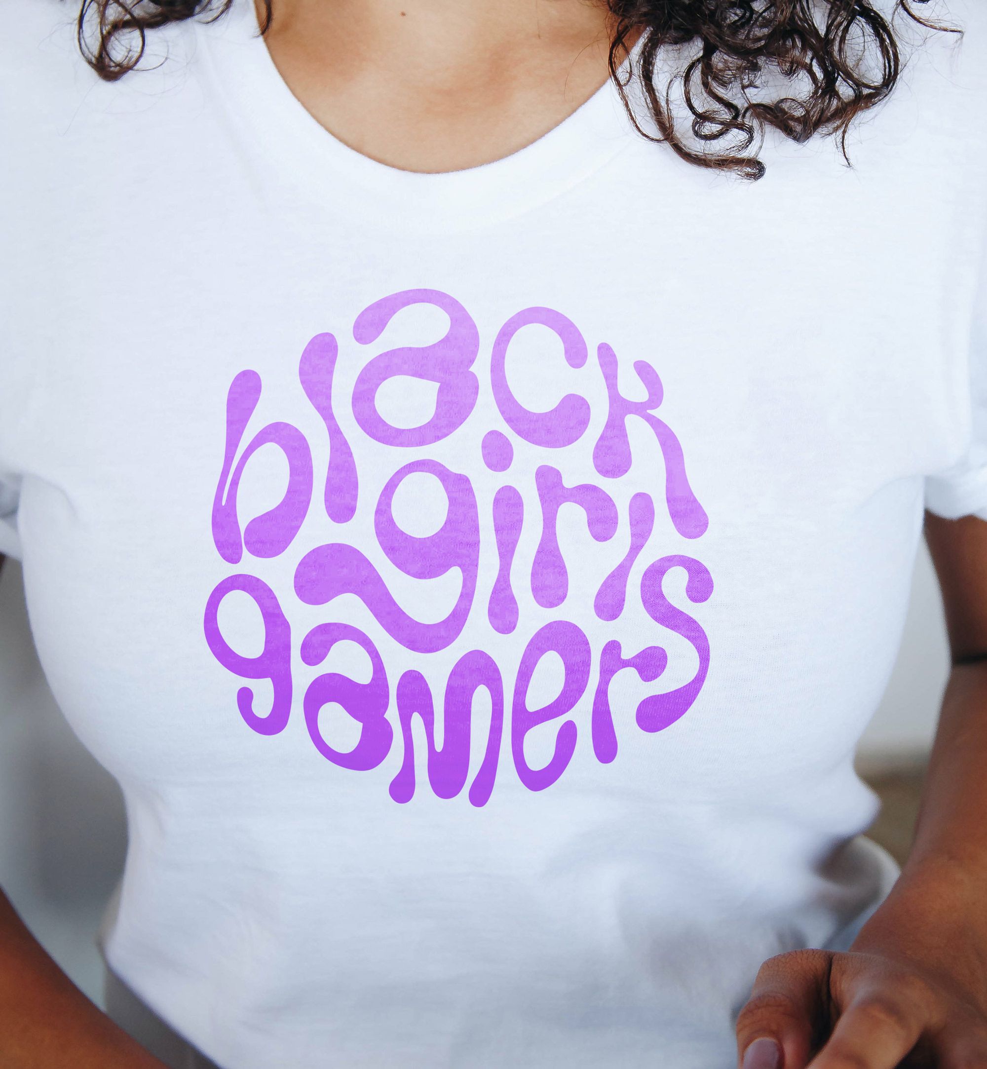
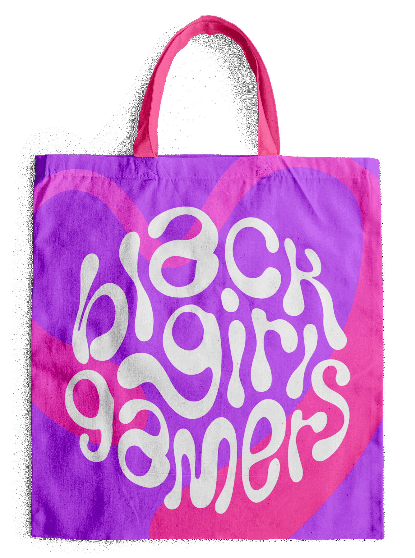
Starter pack for the “glorious gamer night” and future events. It includes a tote bag filled with makeup and goodies, a Black Girl Gamers T-shirt and glamorous custom nail stickers.
