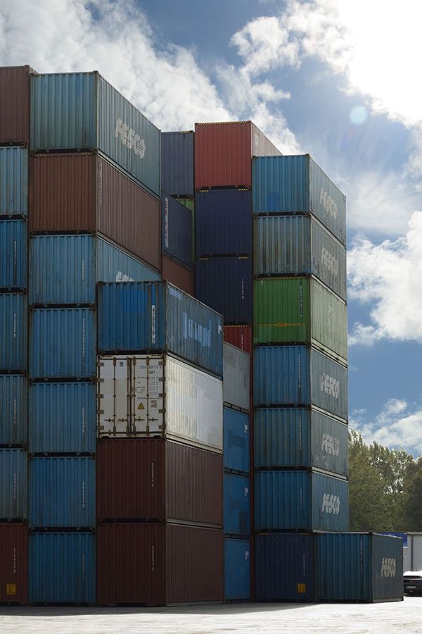
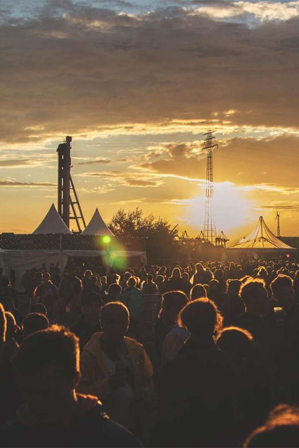
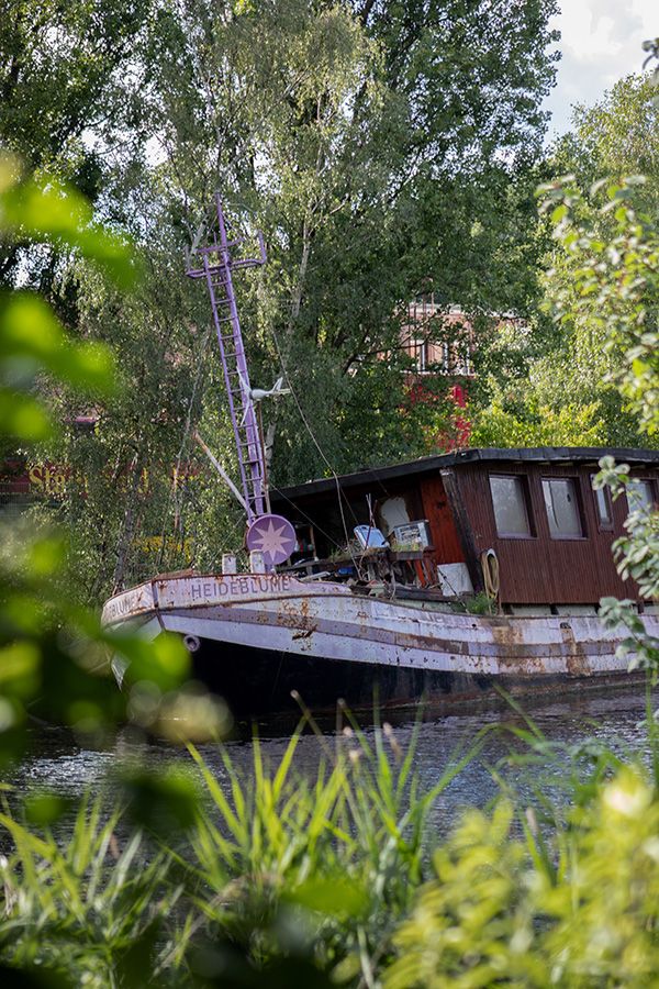
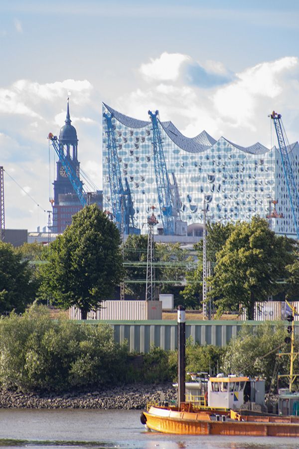
People with different backgrounds, experiences and histories, as well as nature, industry and the city come together here. This results in the unique colourful and lively cityscape of Wilhelmsburg.
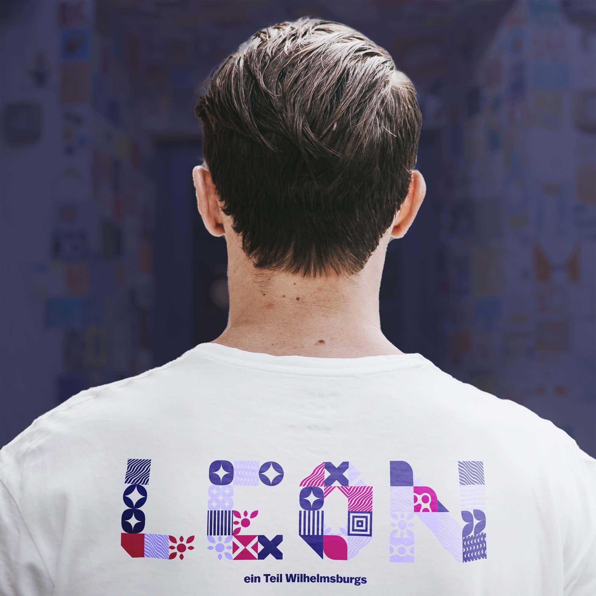
Through an ever-changing, colourful and modular pattern, made up of various overlapping elements, the interplay of individual different parts of Wilhelmsburg is visually represented.

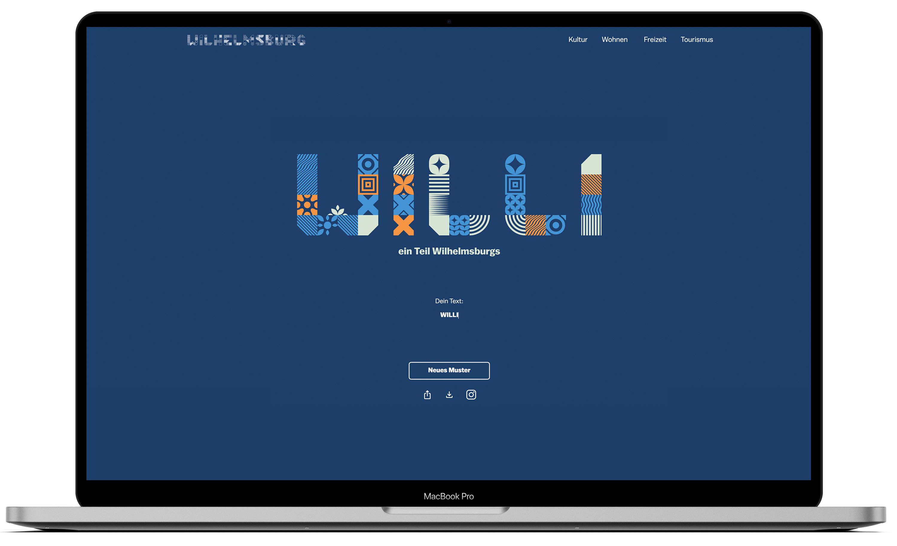
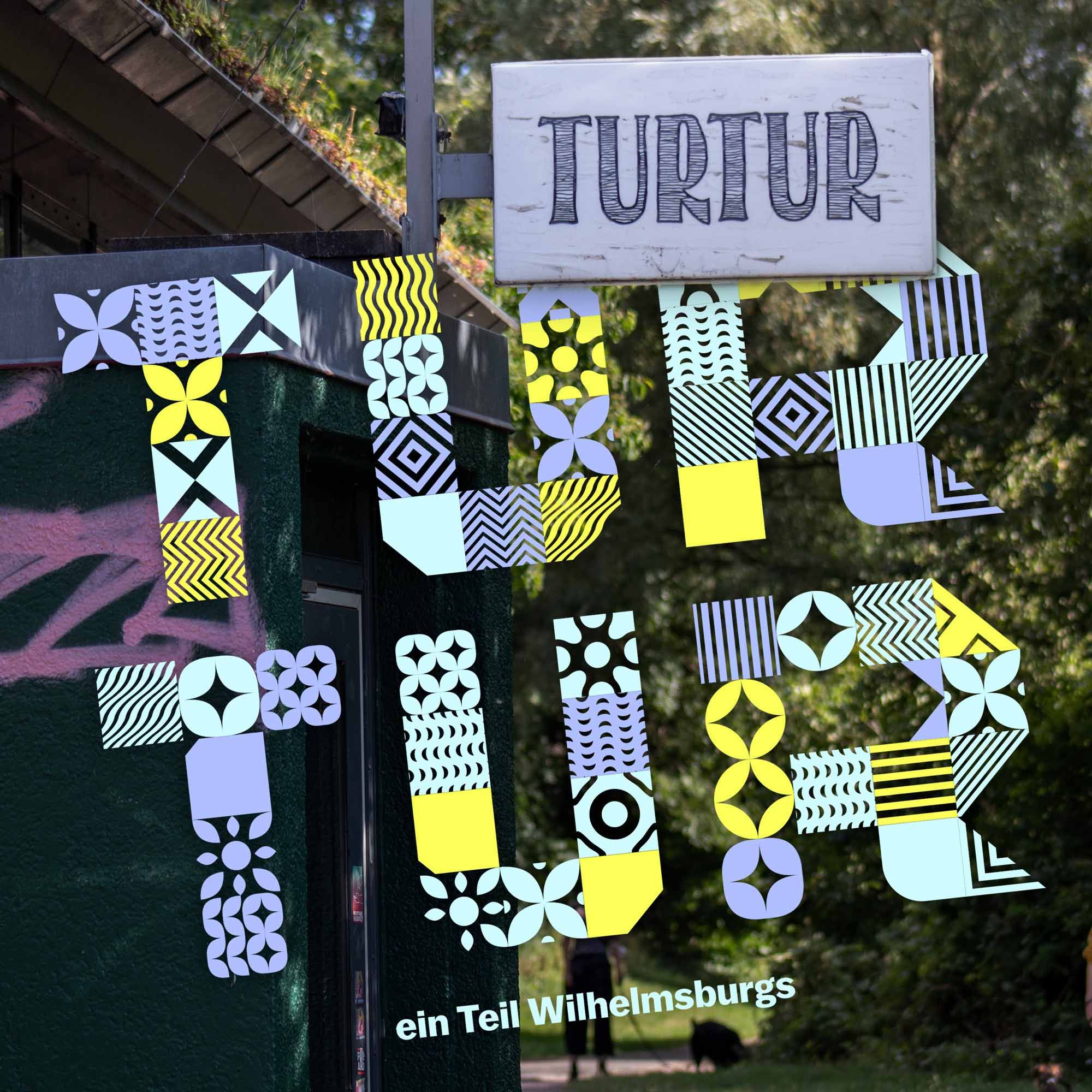
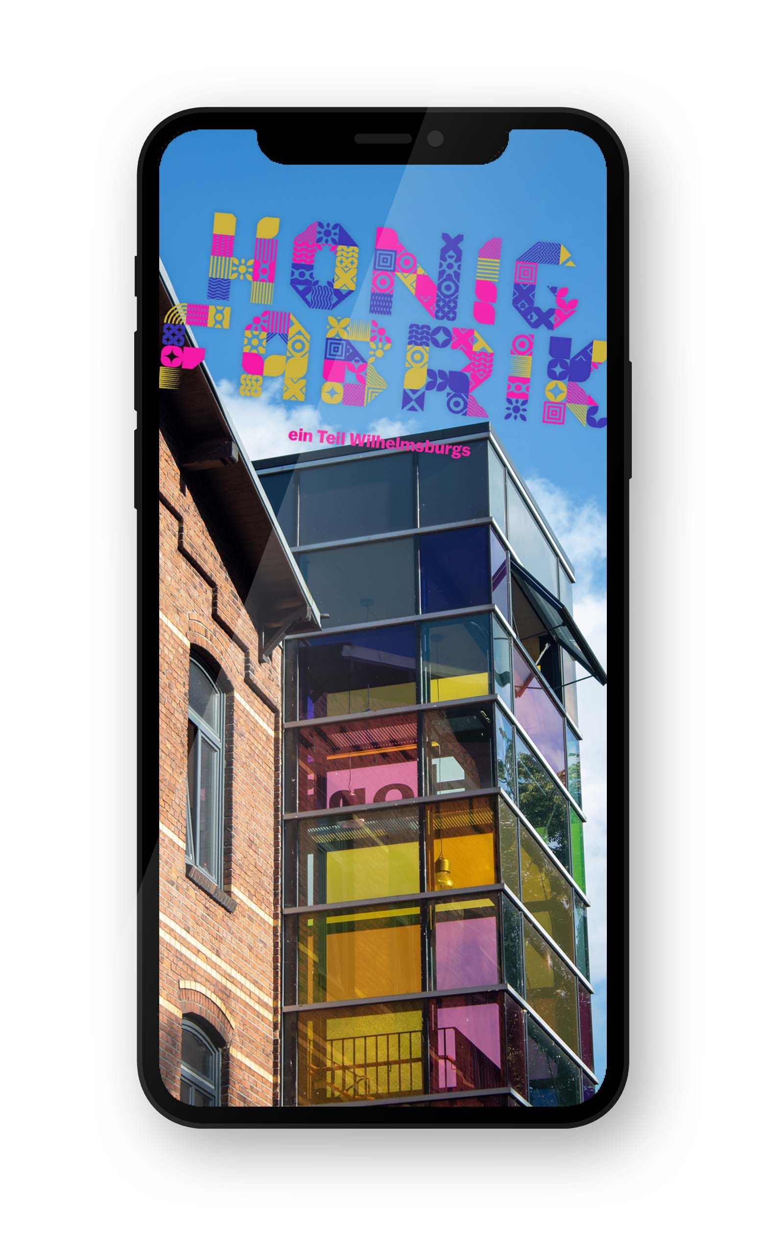
A modular typography was designed, which always looks unique and is assembled by different individual elements. It reflects the diversity of the district and shows how individual parts of Wilhelmsburg come together to form a whole. To build up the individual letters with random elements, a script was programmed that processes the input text and converts it into a visual output.

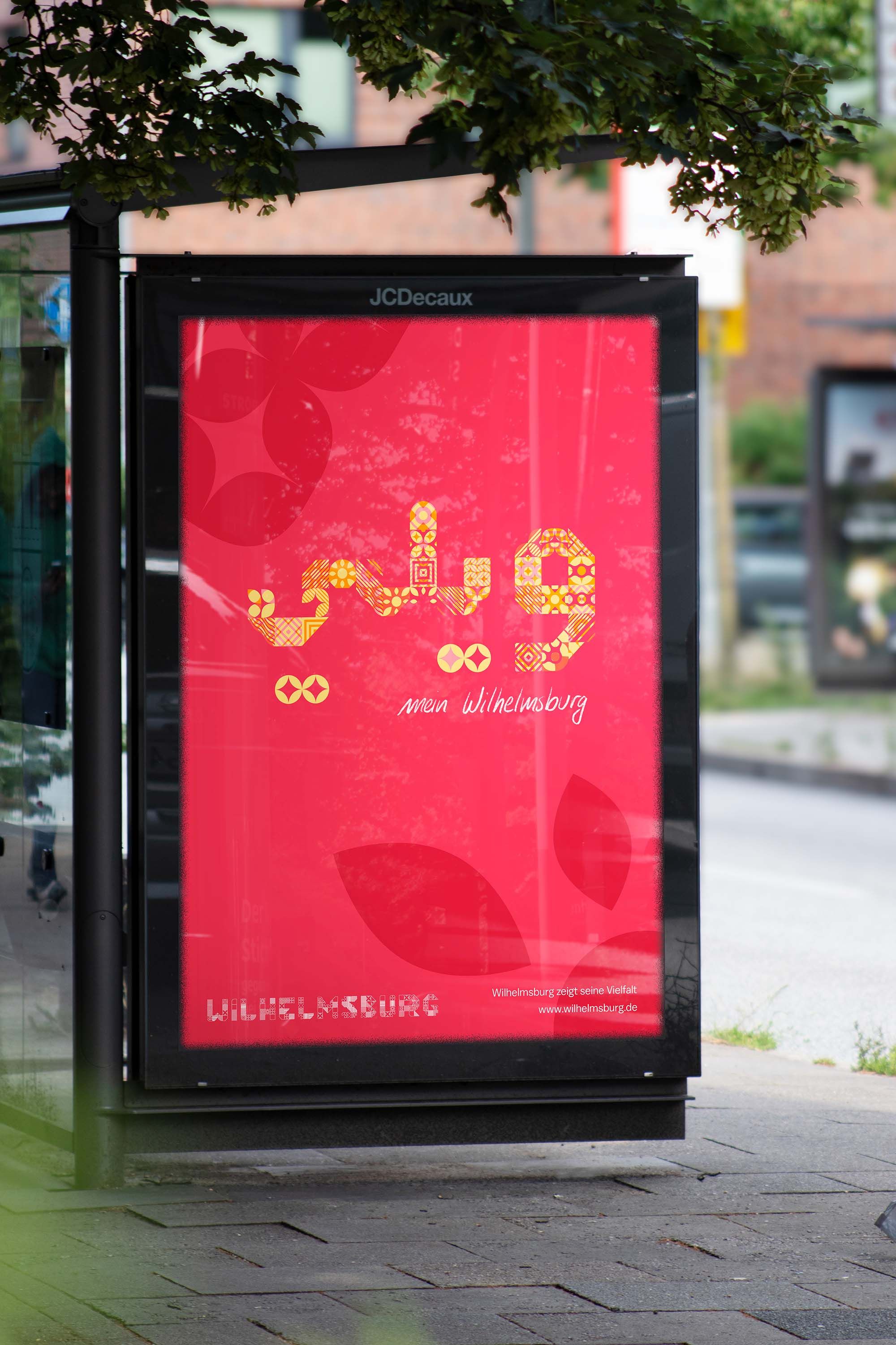
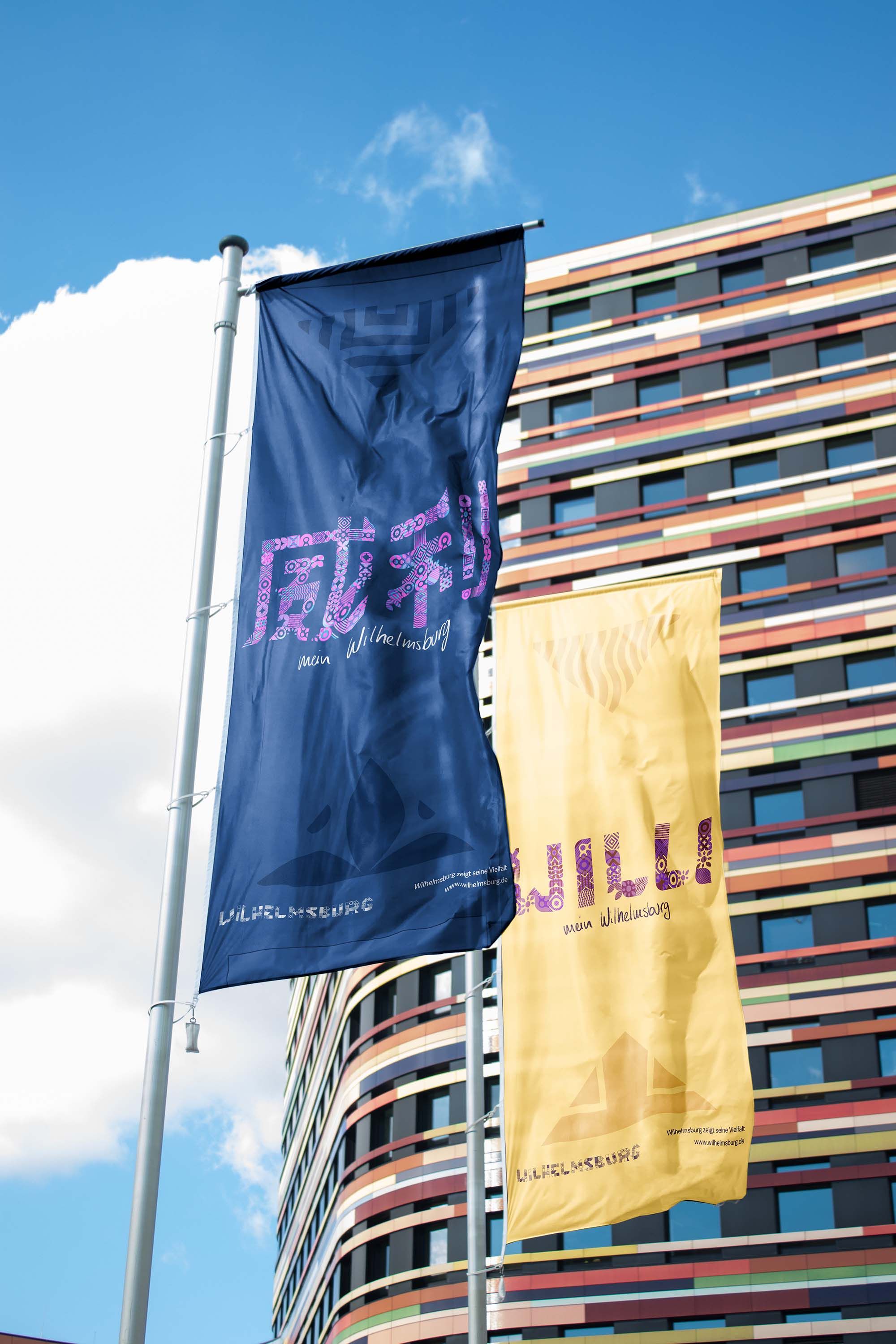
To also highlight the cultural diversity of Wilhelmsburg, the modular typography is also implemented with other alphabets. Part of the branding refers to the names used by the residents of the district. Most call Wilhelmsburg "Willy", which in other alphabets, commonly used in the district, is written Уили (Bulgarian), 威利 (Mandarin), ويلي (Arabic) or Вилли (Russian).
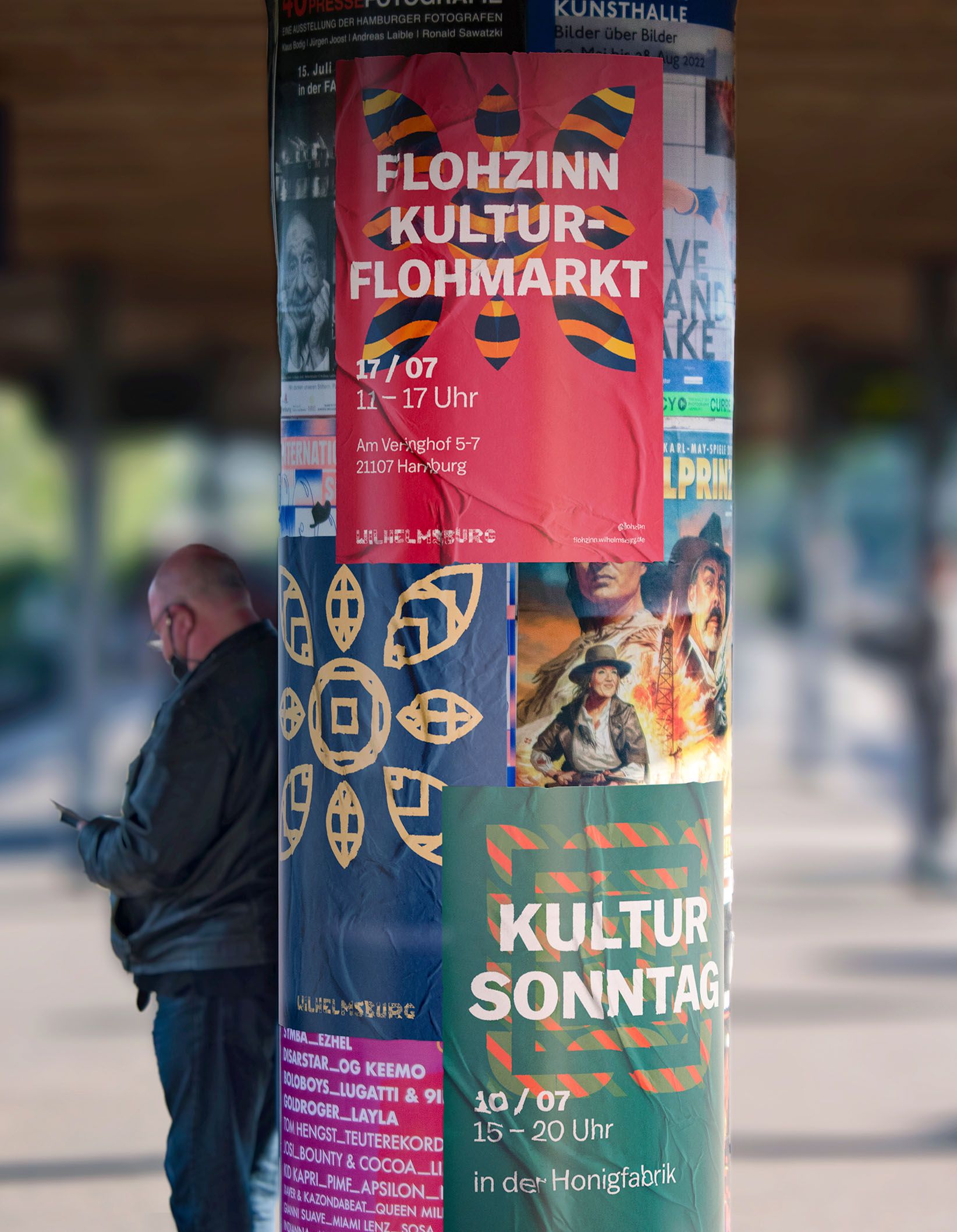
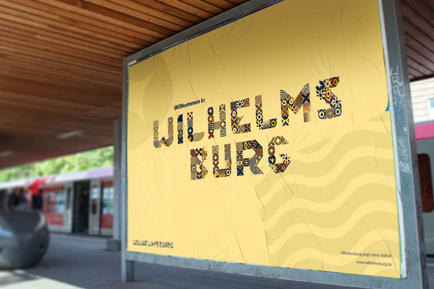
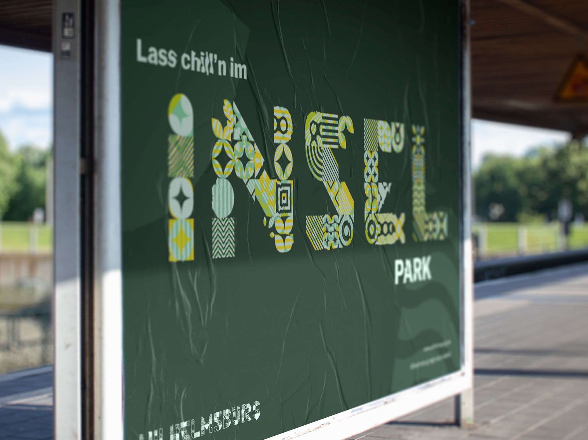
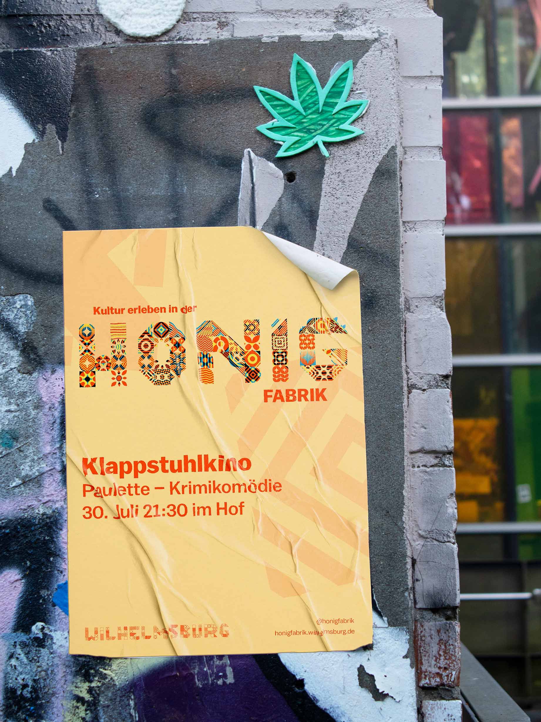
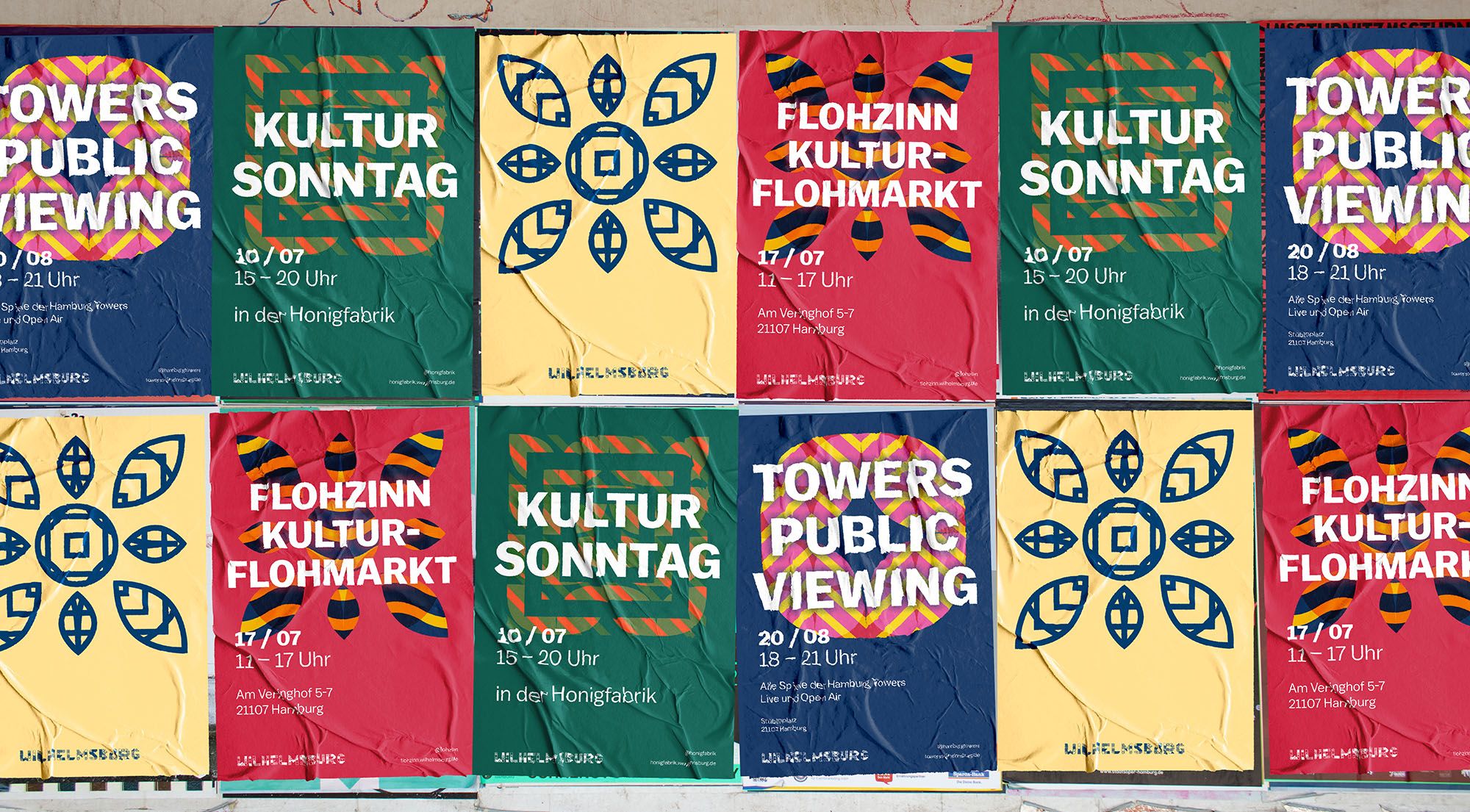
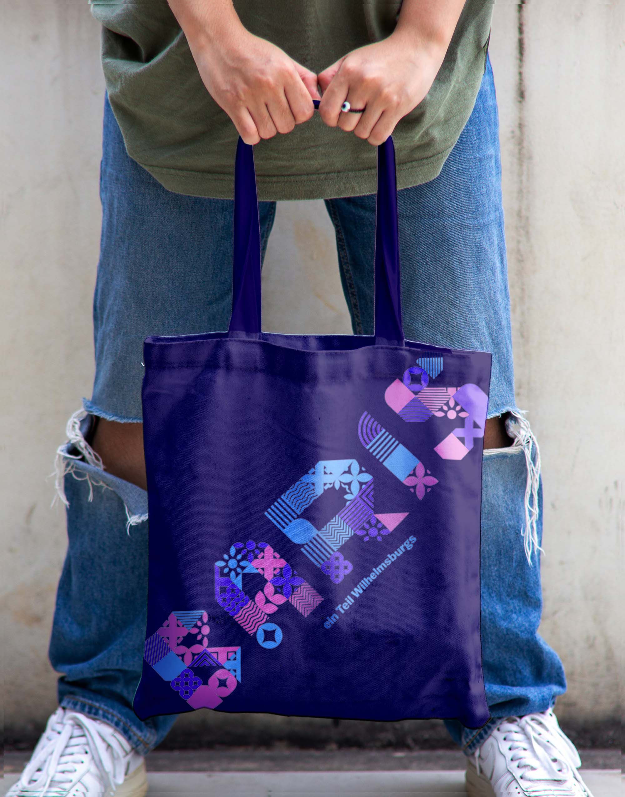
In addition to posters advertising various events promoted by the district, the new identity is used to communicate the diversity of Wilhelmsburg to the outside world.Sights and possible excursions, for example, are advertised to underline how diverse and fun the district can be.
