

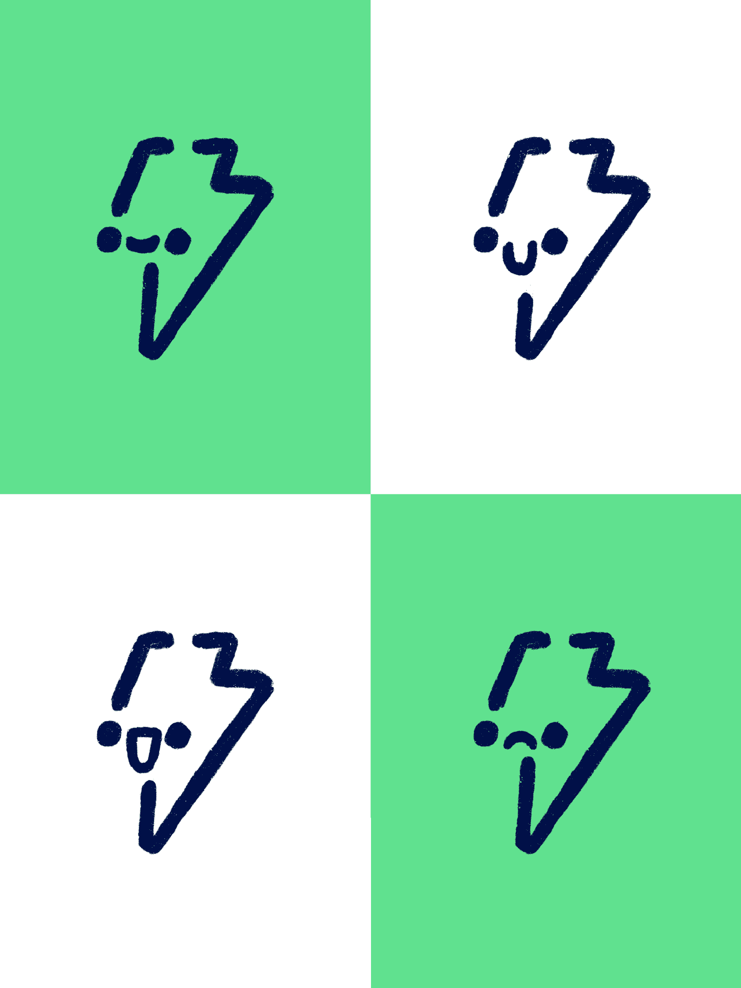
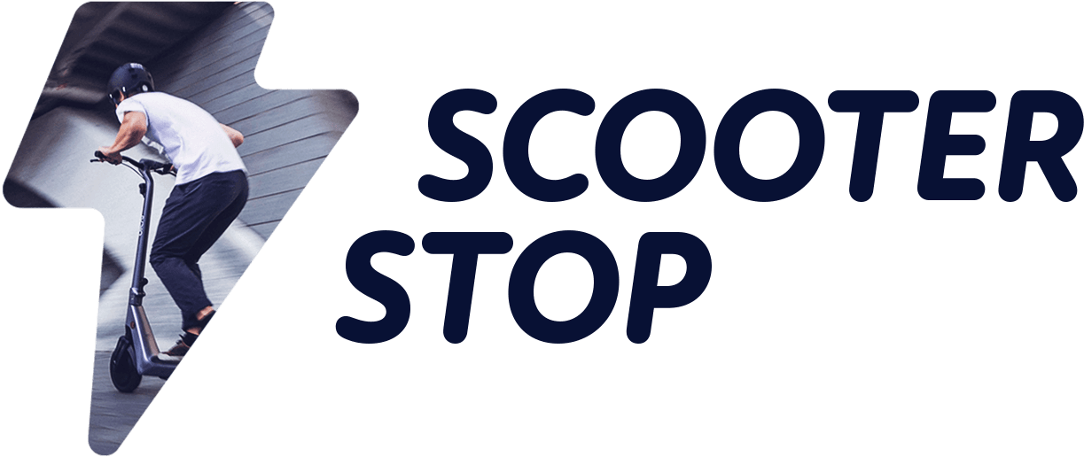
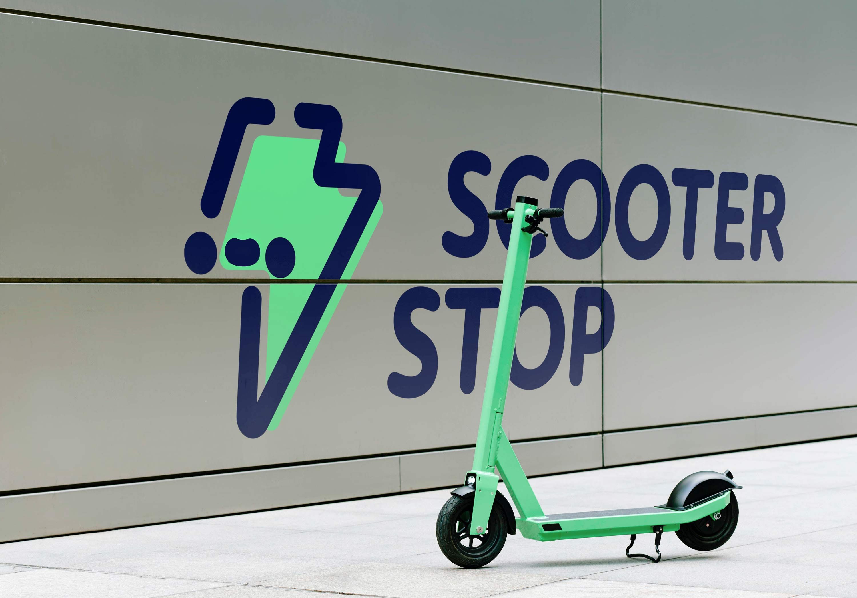
The logo embodies the sustainability and energy of e-mobility through a creative fusion of a green lightning bolt and a pedal scooter, directly referencing the company’s core products.
This unique combination forms a friendly character, with the scooter’s wheels as eyes and its deck as the mouth. The character encapsulates the playful and enjoyable aspects of e-mobility, resulting in a dynamic and engaging logo that resonates with a younger audience.
This unique combination forms a friendly character, with the scooter’s wheels as eyes and its deck as the mouth. The character encapsulates the playful and enjoyable aspects of e-mobility, resulting in a dynamic and engaging logo that resonates with a younger audience.
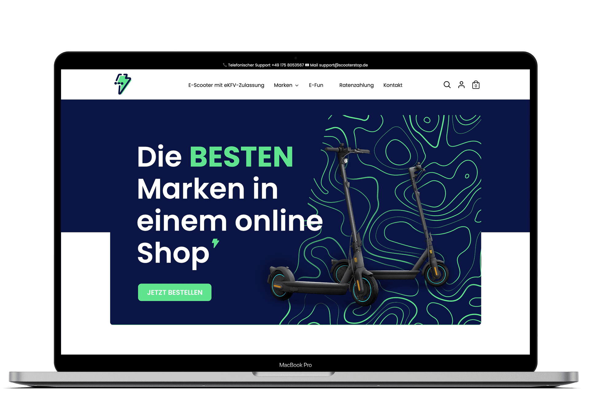
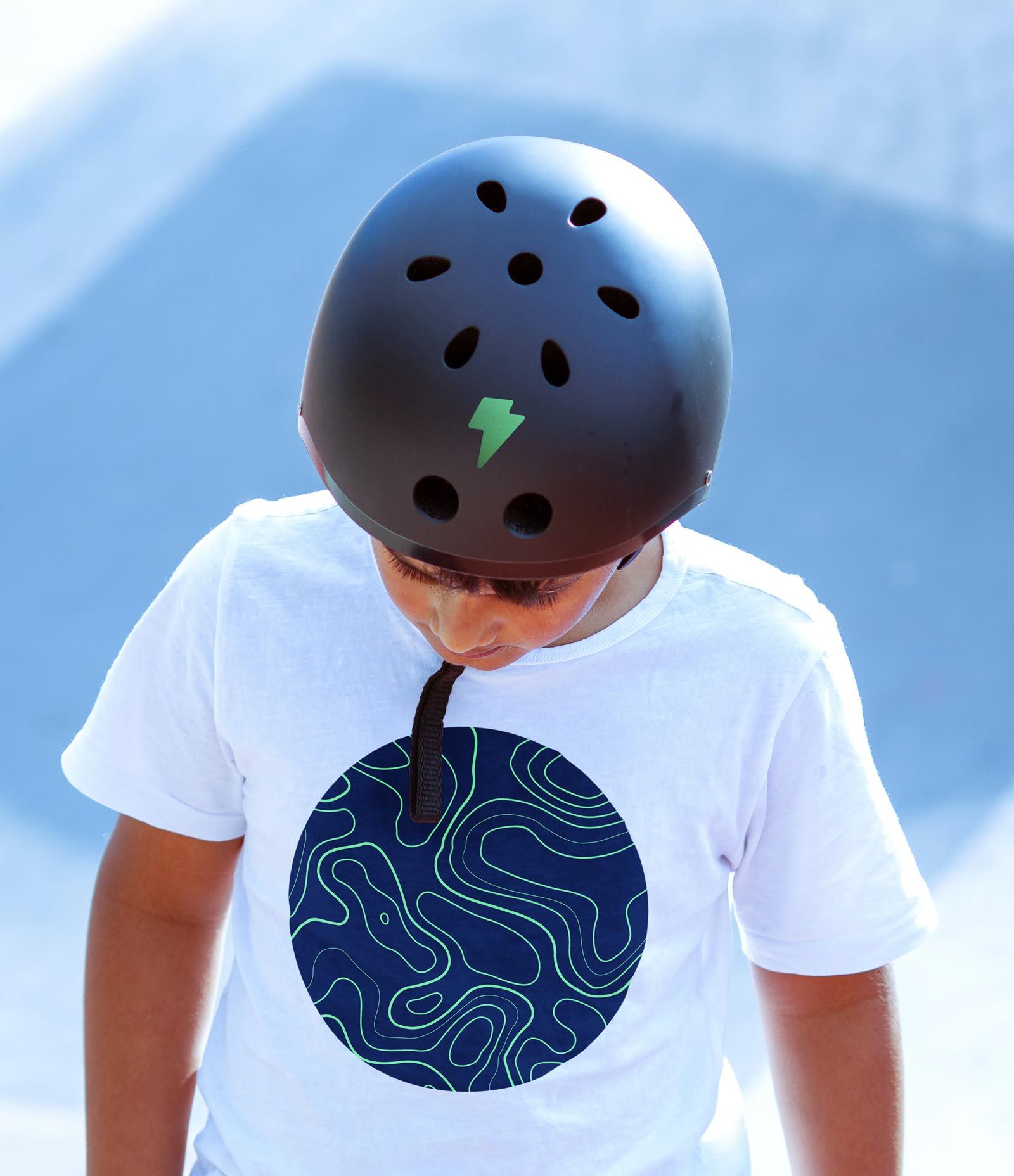
The brand's pattern is inspired by topographical maps, symbolising movement and the vast landscapes that e-scooters can easily navigate. This design choice emphasises the freedom and accessibility offered by the brand's products.The logotype complements the shape of the logo, reinforcing the theme of movement and integrating seamlessly into the overall brand identity.

The website features a striking header that highlights selected scooters, supported by a clear call-to-action that invites users to explore the range further.The design demonstrates how typography, branding and visuals work together to create a compelling digital brand experieence.
